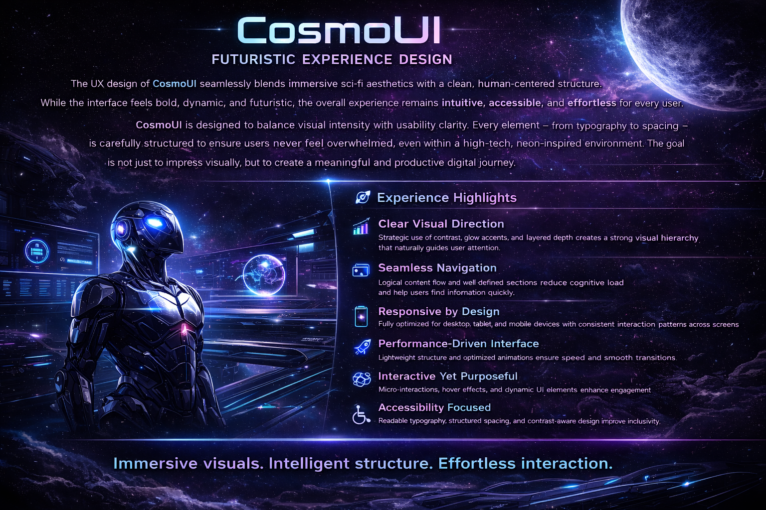
The UX design of CosmoUI seamlessly blends immersive sci-fi aesthetics with a clean, human-centered structure. While the interface feels bold, dynamic, and futuristic, the overall experience remains intuitive, accessible, and effortless for every user.
CosmoUI is designed to balance visual intensity with usability clarity. Every element—from typography to spacing—is carefully structured to ensure users never feel overwhelmed, even within a high-tech, neon-inspired environment. The goal is not just to impress visually, but to create a meaningful and productive digital journey.
Clear Visual Direction – Strategic use of contrast, glow accents, and layered depth creates a strong visual hierarchy that naturally guides user attention.
Seamless Navigation – Logical content flow and well-defined sections reduce cognitive load and help users find information quickly.
Responsive by Design – Fully optimized for desktop, tablet, and mobile devices with consistent interaction patterns across screens.
Performance-Driven Interface – Lightweight structure and optimized animations ensure speed and smooth transitions.
Interactive Yet Purposeful – Micro-interactions, hover effects, and dynamic UI elements enhance engagement without distraction.
Accessibility Focused – Readable typography, structured spacing, and contrast-aware design improve inclusivity.
Scalable Architecture – Modular components allow easy expansion for future features and growth.
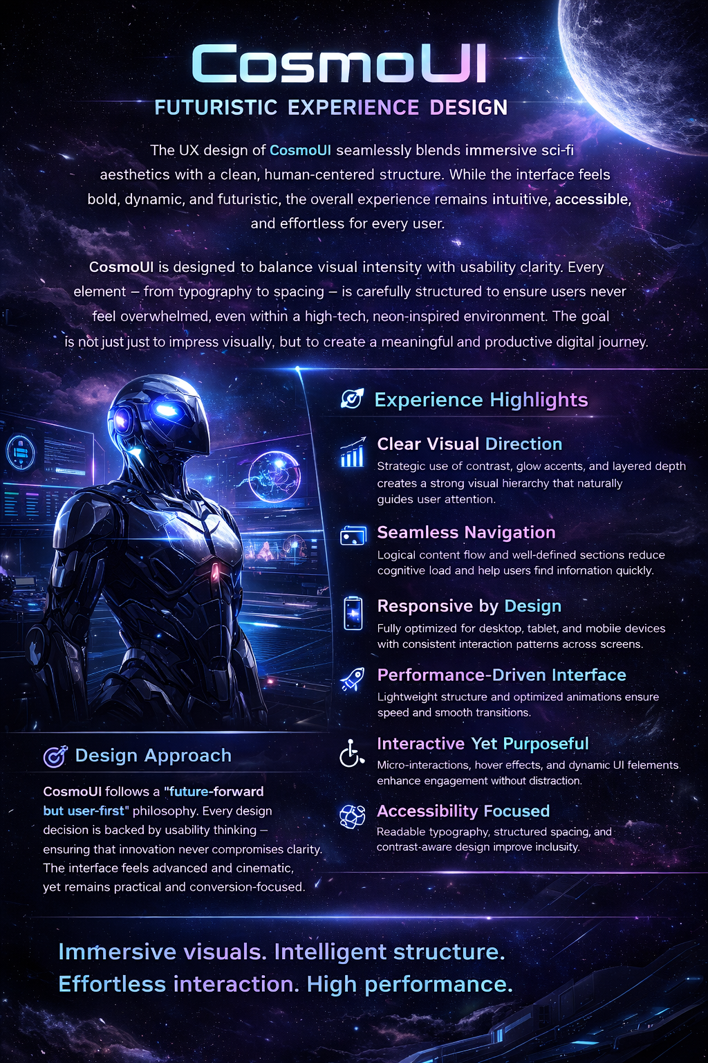
CosmoUI follows a “future-forward but user-first” philosophy. Every design decision is backed by usability thinking—ensuring that innovation never compromises clarity. The interface feels advanced and cinematic, yet remains practical and conversion-focused.